Data Visualization using Matplotlib and Seaborn
Learning Objectives
After completing this tutorial, students should be able to:
- Load and inspect datasets using pandas library
- Visualize data using Matplotlib
- Describe parts of a Matplotlib figure
- Create plots of various types (e.g., line plots, scatter plots) using pyplot
- Visualize data using Seaborn
- Create plots using axes-level and figure-level functions in Seaborn
- Visualize statistical relationships
- Visualize distributions
- Visualize categorical data
This tutorial references content from the matplotlib tutorial and seaborn tutorial.
Loading and Inspecting Datasets
We will work with the dataset of Broadway Shows, which is available in csv (comma-separated values) format from Kaggle.
For your convenience, the cleaned data file ("broadway_clean.csv") has been uploaded on Canvas along with this notebook. Please take some time to understand this dataset by going through the Data Dictionary at the above link, as it will help you appreciate the objectives of the various visualizations we are going to create.
pandas (Python Data Analysis Library) provides convenient functions to work with data in Python. The most-used data structure in pandas is DataFrame, which is essentially a table representation of the data.
We use the function read_csv() to load our Broadway Shows data into a DataFrame variable.
After loading the data, it is common to grab the first few rows of the resulting table to see what the dataset looks like.
There are various DataFrame properties you can query to inspect the data. For instance, shape gives you the dimension of the data table in the form of (num_of_rows, num_of_columns). This can be useful to check that the whole dataset is properly loaded and no row / column is missed out from the file.
EXERCISE:
A few easy tasks to get you warmed up! Look up how to do the following for the Broadway Shows dataset, and fill up the code cells that are tagged with TODO.
1. Get the last 8 rows.
2. Generate descriptive statistic summary of the dataset.
3. Select only the year, show name, and gross revenue columns.
4. Select only rows with filled capacity of 50% or more.
The guides on pandas documentation page may come in handy!
We are now ready to use the Broadway Shows dataset to do some data visualisations.
Introduction to Matplotlib
Matplotlib is a Python plotting library that produces high-quality figures in a variety of formats and across platforms.
Matplotlib graphs your data on Figures (i.e., windows, Jupyter widgets, etc.), each of which can contain one or more Axes (i.e., an area where points can be specified in terms of x-y coordinates (or theta-r in a polar plot, or x-y-z in a 3D plot, etc.).
Let us look at what makes up a Matplotlib Figure to get familiar with the terms.

Introduction to Pyplot
The easiest way to create a new Figure is with pyplot. matplotlib.pyplot provides a collection of functions to work with a Figure, e.g. creating a Figure, creating a plotting area in a Figure, plotting lines, etc.
For Jupyter notebooks, we set %matplotlib inline magic to output the plotting commands inline in our notebooks.
Basic Plot
Before we work with our dataset, let's get a feel of building a basic plot and setting the Figure components.
As the following code shows, we can create several plots on the same graph. A line plot is created using pyplot.plot and a scatter plot is created using pyplot.scatter.
EXERCISE:
Explore the API references for pyplot.plot and pyplot.scatter to complete the TODO tasks below.
Let us now create visualizations for the Broadway Shows dataset.
Line Plot
Line plots are useful to explore trends in the dataset. Let's try to see how the different variables change over the months in a year.
To do this, we first aggregate the data by month.
Let's plot the mean attendance numbers over the months.
The plot suggests that the mean attendance of Broadway shows goes higher around summer months, which is reasonable.
EXERCISE:
Plot the mean gross revenue of shows grouped by year. Do you see any interesting trend of the gross revenue over the years?
Is there any caveat when interpreting revenue data in real life?
Scatter Plot
Scatter plots are useful for observing the relationship between two variables. For example, we can use it to see how the gross revenue changes when the attendance numbers changes.
Here, we use pyplot.subplots to give us a way to plot multiple plots on a single figure, which will come into play later.
Working with Multiple Plots
We can make the graph above more informative, for example, by using colors to differentiate whether the show is a Musical, a Play, or a Special.
This can be achieved by essentially creating one scatter plot for each show type, using a different color for each, all placed in a single Figure.
EXERCISE:
Complete the TODO tasks below.
What if we have many categories? We can define arrays to map the categories and create the subplots in a loop. The following code uses a loop to create the same graph as the previous code.
EXERCISE:
Create scatter subplots to show how the gross revenue changes when the filled capacity changes, for five theatres with the largest number of show runs in the whole dataset. Use a loop to differentiate the theatres by color.
How do the theatres differ in terms of capacity-revenue relationship?
The following code helps you find out which are the top five theatres.
Bar Plot
Bar plots are useful to see counts of categorical variables. For instance, we can visualize the distribution of the different show types across all show runs.
We first construct the {show type, count of show runs} table.
We create a bar plot using the pyplot.bar function, specifying the x coordinates (categories) and the height of the bars (values). In our case, the categories are the show types, and the values are the count of show runs.
As with other Matplotlib plotting functions, pyplot.bar expects numpy arrays as inputs. We will need to convert our pandas data objects to numpy.array objects prior to plotting.
Stacked Bar Plot
We can create a stacked bar plot using pyplot.subplots, essentially by drawing a plot on top of another.
EXERCISE:
Follow the logic in this example from Matplotlib gallery to create a stacked bar plot of show types for two theatres: "Walter Kerr" and "Neil Simon".
The below TODO tasks give you the outline of the steps you will need.
The categories remain the same show types, but you will now have two count arrays, one for the "Walter Kerr" theatre and one for the "Neil Simon" theatre.
Pie Chart
Pie chart is an intuitive way to see proportions in data. We can create a pie chart to see how much each show name contributes to the gross revenue of a given theatre, for example the "Criterion" theatre.
A pie chart can be created using the pyplot.pie function.
EXERCISE:
Create a pie chart to visualize the proportion of total attendance in each show name, for the "Winter Garden" theatre.
Introduction to Seaborn
Seaborn is a library for making statistical graphics in Python. It builds on top of matplotlib and integrates closely with pandas data structures. Seaborn is a complement, not a substitute to Matplotlib, but it makes a few-well defined hard usual tasks easy to do.
Overview of Seaborn's Plotting Functionality
Seaborn organizes plotting functions into modules of functions that achieve similar visualization goals through different means.
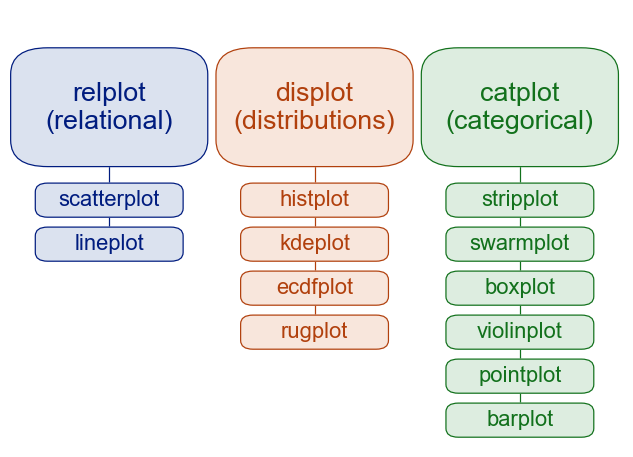
The most commonly used modules are relational (for visualizing statistical relationships), distributional (for visualizing distributions), and categorical (for visualizing categorical data). Other than these, there are also regression plots and matrix plots, as listed in the documentation.
In addition to these modules, there is a cross-cutting classification of seaborn functions as “axes-level” or “figure-level”.
Axes-level functions make self-contained plots. They act like drop-in replacements for matplotlib functions, plotting data onto a single matplotlib.pyplot.Axes object. While they add axis labels and legends automatically, they don’t modify anything beyond the axes that they are drawn into.
In contrast, figure-level functions interface with Matplotlib through a Seaborn object, usually a FacetGrid, that manages the figure. Because these functions "own" their own figure, they can implement features such as putting the legend outside of the plot.
Each module has a single figure-level function, which offers a unitary interface to its various axes-level functions. The high-level view as available on the tutorial website is:
Visualization with Seaborn
The set_theme function sets the matplotlib parameters and hence the theme will now apply to all plots using matplotlib - whether plotted through seaborn or not. This is also the default theme.
Relational Functions
Let us look at a few plots that belong to the relational module, and get a sense of how we use axes-level functions (e.g., scatterplot) compared to how we use the corresponding figure-level function (i.e., relplot).
Scatterplot
Using Seaborn's axes-level scatterplot function, we can easily recreate the scatter plot of gross revenue against attendance that we did previously using matplotlib, albeit with different colors.
Unlike when using matplotlib directly, it is not necessary to specify attributes of the plot elements in terms of the color values or marker codes. Behind the scenes, seaborn handles the translation from values in the dataframe to arguments that matplotlib understands.
EXERCISE:
Refer to the scatterplot API reference to visualize how gross revenue changes with attendance numbers, for shows after the year 2015, using different colors for different show types.
Hint: What arguments should you specify to the function as data, x, y, and hue?
Relplot
Alternatively, we can use the figure-level function relplot to visualize the same relationship of gross revenue against attendance.
Figure-level functions are powerful in visualising additional variables, such as the theatre and the show type, which can easily be specified within the same function.
EXERCISE:
Refer to the relplot API reference for the syntax, and use relplot to visualize how gross revenue changes with attendance numbers, for shows after the year 2015. Use the hue and style arguments to visualize the different theatres and show types respectively.
As we know, too much information becomes difficult to understand in a single plot. However, the aim here is to demonstrate how easy it is to create the plot using seaborn.
Estimating Regression Fits using lmplot
Aside from the axes-level vs figure-level usage, the scatter plot in the above exercises can be further enhanced using Seaborn lmplot to include a linear regression model (and its uncertainty).
In the simplest invocation, the lmplot function draws a scatter plot of two variables, x and y, and then fit the regression model y ~ x and plot the resulting regression line and a 95% confidence interval for that regression.
EXERCISE:
Refer to the lmplot API reference for the syntax, and use it to fit the regression model for the above scatter plot of gross revenue vs attendance of shows after 2015.
Hint: What arguments should you specify to the function as data, x, and y?
Distributional Functions
In the distributional module, one of the axes-level function is kdeplot, while the figure-level function is displot.
KDE Plot
The kdeplot function is a kernel density estimate plot to visualise the distribution of observations in a dataset. For example, we can plot the distribution of show types across the years.
Displot
Similar to what we have seen for the relational module, the figure-level function allows us to visualize multiple features very easily.
With the same objective of plotting the distribution of show types across the years, the displot function can be used to display bar plots along with distribution estimates (a KDE plot).
Jointplot
Seaborn jointplot is a function cannot be categorized neatly, as it can be used to plot a relationship between two variables while simultaneously exploring the distribution of each underlying variable.
With the same visualization objectives as previous exercises, let us visualize the relationship between the attendance and gross revenue, along with the distribution of each variable. The show type can simultaneously be shown easily.
Categorical Functions
Categorical plotting functions visualize the distribution with respect to categories.
Let us prepare our dataset by converting the month and year variables to category for visualization.
Boxplot
Boxplots are plots that show the distribution of a dataset based on its five-number summary of data points: the minimum, first quartile (Q1), median, third quartile (Q3), and the maximum. Boxplots also show us the outliers, whether the data is symmetrical, how tightly the data is grouped, and if and how the data is skewed.
The axes-level boxplot function visualizes boxplots with respect to a categorical variable.
EXERCISE:
Suppose we want to see whether show attendance is higher in any particular month.
Refer to the examples on the boxplot API reference and use boxplot to visualize this distribution.
Hint: What is the categorical variable (y)? What is the variable whose distribution we want to see (x)?
Countplot
Another axes-level function in the categorical module is countplot, which shows the counts of observations in each categorical bin using bars. A countplot can be thought of as a histogram across a categorical, instead of quantitative, variable.
EXERCISE:
Suppose we want to see whether certain show types are more prevalent in any particular month.
Refer to the examples on the countplot API reference and use countplot to visualize this distribution.
Hint: What is the categorical variable (x)? Which variable occurences do we want to observe (hue)?
Catplot
The figure-level catplot function provides access to several axes-level categorical plotting functions, enabling visualization of the relationship between a numerical and one or more categorical variables using one of several visual representations.
The kind parameter selects the underlying axes-level function to use.
Using catplot, it is easy to extend the earlier boxplot to include differentiation by show types.
Extra: Heatmap
The heatmap function plots rectangular data as a color-encoded matrix. It can be used to find any correlation between the various numeric data types in the dataset, whether they are negatively or positively correlated and how strongly.
For our Broadway Shows dataset, we can use corr to compute pairwise correlation of columns, then visualize this using heatmap.
We see relatively high correlation between gross revenue and attendance or filled capacity, which is logical.
Closing Remarks
We have worked through a number of plots using Matplotlib and Seaborn in this tutorial. These are only a small part of the vast collection of visualization capabilities that the two libraries provide.
As you have done in these exercises, when you encounter a visualization goal, consider the nature of the data and the purpose of the visualization (relational, distributional, and so on), then simply look up the guides and API references of the suitable modules!