 |
|
|
|
|
|
|
 |
||||||
 |
||||||
 |
||||||
 |
||||||
 |
||||||
 |
||||||
 |
||||||
 |
||||||
|
||||
 The
Archive
The
Archive
By Amy Fowler This document presents a technical overview of the Swing component architecture. In particular, it covers the following areas in detail:
|
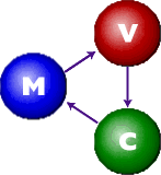
 Most
Swing developers know by now that Swing components have a separable
model-and-view design. And many Swing users have run across
articles saying that Swing is based on something called a "modified
MVC (model-view-controller) architecture."
Most
Swing developers know by now that Swing components have a separable
model-and-view design. And many Swing users have run across
articles saying that Swing is based on something called a "modified
MVC (model-view-controller) architecture."
 The
overall goal for the Swing project was:
The
overall goal for the Swing project was:
| Component | Model Interface | Model Type |
|---|---|---|
JButton |
ButtonModel |
GUI |
JToggleButton |
ButtonModel |
GUI/data |
JCheckBox |
ButtonModel |
GUI/data |
JRadioButton |
ButtonModel |
GUI/data |
JMenu |
ButtonModel |
GUI |
JMenuItem |
ButtonModel |
GUI |
JCheckBoxMenuItem |
ButtonModel |
GUI/data |
JRadioButtonMenuItem |
ButtonModel |
GUI/data |
JComboBox |
ComboBoxModel |
data |
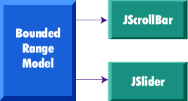
JProgressBar |
BoundedRangeModel |
GUI/data |
JScrollBar |
BoundedRangeModel |
GUI/data |
JSlider |
BoundedRangeModel |
GUI/data |
JTabbedPane |
SingleSelectionModel |
GUI |
JList |
ListModel |
data |
JList |
ListSelectionModel |
GUI |
JTable |
TableModel |
data |
JTable |
TableColumnModel |
GUI |
JTree |
TreeModel |
data |
JTree |
TreeSelectionModel |
GUI |
JEditorPane |
Document |
data |
JTextPane |
Document |
data |
JTextArea |
Document |
data |
JTextField |
Document |
data |
JPasswordField |
Document |
data |
GUI-state vs. application-data models
The models provided by Swing fall into two general categories: GUI-state models and application-data models.
GUI-state models
GUI state models are interfaces that define the visual status of a GUI control, such as whether a button is pressed or armed, or which items are selected in a list. GUI-state models typically are relevant only in the context of a graphical user interface (GUI). While it is often useful to develop programs using GUI-state model separation -- particularly if multiple GUI controls are linked to a common state (such as in a shared whiteboard program), or if manipulating one control automatically changes the value of another -- the use of GUI-state models is not required by Swing. It is possible to manipulate the state of a GUI control through top-level methods on the component, without any direct interaction with the model at all. In the preceding table, GUI-state models in Swing are highlighted in blue.
Application-data models
An application-data model is an interface that represents some quantifiable data that has meaning primarily in the context of the application, such as the value of a cell in a table or the items displayed in a list. These data models provide a very powerful programming paradigm for Swing programs that need a clean separation between their application data/logic and their GUI. For truly data-centric Swing components, such as JTree and JTable, interaction with the data model is strongly recommended. Application-data models are highlighted in red in the table presented at the beginning of this section.
Of course with some components, the model categorization
falls somewhere in between GUI state models
and application-data models, depending on the context in which the
model is used. This is the case with the BoundedRangeModel
on JSlider or JProgressBar. These models
are highlighted in purple in the preceding
table.
Swing's separable model API makes no specific distinctions between GUI state models and application-data models; however, we have clarified this difference here to give developers a better understanding of when and why they might wish to program with the separable models.
Shared model definitions
Referring again to the table
at the beginning of this section, notice that model definitions
are shared across components in cases where
the data abstraction for each component is similar enough
to support a single interface without over-genericizing that interface.
Common models enable automatic connectability between component
types. For example, because both JSlider and JScrollbar
use the BoundedRangeModel interface, a single BoundedRangeModel
instance could be plugged into both a JScrollbar and
a JSlider and their visual state would always remain
in sync.
The separable-model API
Swing components that define models support a JavaBeans
bound property for the model. For example, JSlider
uses the BoundedRangeModel interface for its model
definition. Consequently, it includes the following methods:
public BoundedRangeModel getModel()public void setModel(BoundedRangeModel model)
All Swing components have one thing in common: If
you don't set your own model, a default is created and installed
internally in the component. The naming convention for these default
model classes is to prepend the interface name with "Default."
For JSlider, a DefaultBoundedRangeModel
object is instantiated in its constructor:
public JSlider(int orientation, int min,int max, int value){checkOrientation(orientation);this.orientation = orientation;this.model =new DefaultBoundedRangeModel(value, 0, min, max);this.model.addChangeListener(changeListener);updateUI();}
If a program subsequently calls setModel(),
this default model is replaced, as in the following example:
JSlider slider = new JSlider();BoundedRangeModel myModel =new DefaultBoundedRangeModel() {public void setValue(int n) {System.out.println("SetValue: "+ n);super.setValue(n);}});slider.setModel(myModel);
For more complex models (such as those for JTable
and JList), an abstract model implementation is also
provided to enable developers to create their own models without
starting from scratch. These classes are prepended with "Abstract".
For example, JList's model interface
is ListModel, which provides both DefaultListModel
and AbstractListModel classes to help the developer
in building a list model.
Model change notification
Models must be able to notify any interested parties (such as views) when their data or value changes. Swing models use the JavaBeans Event model for the implementation of this notification. There are two approaches for this notification used in Swing:
- Send a lightweight notification that the state has
"changed" and require the listener to respond by sending
a query back to the model to find out what has changed.
The advantage of this approach is that a single event instance
can be used for all notifications from a particular model --
which is highly desirable when the notifications tend to be
high in frequency (such as when a
JScrollBaris dragged).
- Send a stateful notification that describes more precisely
how the model has changed. This alternative requires
a new event instance for each notification. It is desirable
when a generic notification doesn't provide the listener with
enough information to determine efficiently what has changed
by querying the model (such as when a column of cells change
value in a
JTable).
Lightweight notification
The following models in Swing use the lightweight
notification, which is based on the ChangeListener/ChangeEvent
API:
| Model | Listener | Event |
|---|---|---|
| BoundedRangeModel | ChangeListener | ChangeEvent |
| ButtonModel | ChangeListener | ChangeEvent |
| SingleSelectionModel | ChangeListener | ChangeEvent |
The ChangeListener interface has a single generic method:
public void stateChanged(ChangeEvent e)The only state in a ChangeEvent is the event "source." Because the source is always the same across notifications, a single instance can be used for all notifications from a particular model. Models that use this mechanism support the following methods to add and remove ChangeListeners:
public void addChangeListener(ChangeListener l)public void removeChangeListener(ChangeListener l)
Therefore, to be notified when the value of a JSlider
has changed, the code might look like this:
JSlider slider = new JSlider();BoundedRangeModel model = slider.getModel();model.addChangeListener(new ChangeListener() {public void stateChanged(ChangeEvent e) {// need to query the model// to get updated value...BoundedRangeModel m =(BoundedRangeModel)e.getSource();System.out.println("model changed: " +m.getValue());}});
To provide convenience for programs that don't wish to deal with separate model objects, some Swing component classes also provide the ability to register ChangeListeners directly on the component (so the component can listen for changes on the model internally and then propagates those events to any listeners registered directly on the component). The only difference between these notifications is that for the model case, the event source is the model instance, while for the component case, the source is the component.
So we could simplify the preceding example to:
JSlider slider = new JSlider();slider.addChangeListener(new ChangeListener() {public void stateChanged(ChangeEvent e) {// the source will be// the slider this time..JSlider s = (JSlider)e.getSource();System.out.println("value changed: " +s.getValue());}});
Stateful notification
Models that support stateful notification provide event Listener interfaces and event objects specific to their purpose. The following table shows the breakdown for those models:
The usage of these APIs is similar to the lightweight notification, except that the listener can query the event object directly to find out what has changed. For example, the following code dynamically tracks the selected item in a JList:
String items[] = {"One", "Two", "Three");JList list = new JList(items);ListSelectionModel sModel = list.getSelectionModel();sModel.addListSelectionListener(new ListSelectionListener() {public void valueChanged(ListSelectionEvent e) {// get change information directly// from the event instance...if (!e.getValueIsAdjusting()) {System.out.println("selection changed: " +e.getFirstIndex());}}});
Automatic View Updates
A model does not have any intrinsic knowledge of the view that represents it. (This requirement is critical to enable multiple views on the same model). Instead, a model has only a list of listeners interested in knowing when its state has changed. A Swing component takes responsibility for hooking up the appropriate model listener so that it can appropriately repaint itself as the model changes (if you find that a component is not updating automatically when the model changes, it is a bug!). This is true whether a default internal model is used or whether a program installs its own model implementation.
Ignoring models completely
As mentioned previously, most components provide the
model-defined API directly in the component class so that the component
can be manipulated without interacting with the model at all. This
is considered perfectly acceptable programming practice (especially
for the GUI-state models). For example, following is JSlider's
implementation of getValue(), which internally delegates
the method call to its model:
public int getValue() {return getModel().getValue();}
And so programs can simply do the following:
JSlider slider = new JSlider();int value = slider.getValue();//what's a "model," anyway?
Separable model summary
So while it's useful to understand how Swing's model design works, it isn't necessary to use the model API for all aspects of Swing programming. You should carefully consider your application's individual needs and determine where the model API will enhance your code without introducing unnecessary complexity.
In particular, we recommend the usage of the Application-Data
category of models for Swing (models for JTable, JTree,
and the like) because they can greatly enhance the scalability and
modularity of your application over the long run.
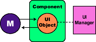
Swing's pluggable look-and-feel architecture allows us to provide a single component API without dictating a particular look-and-feel. The Swing toolkit provides a default set of look-and-feels; however, the API is "open" -- a design that additionally allows developers to create new look-and-feel implementations by either extending an existing look-and-feel or creating one from scratch. Although the pluggable look-and-feel API is extensible, it was intentionally designed at a level below the basic component API in such a way that a developer does not need to understand its intricate details to build Swing GUIs. (But if you want to know, read on . . .)
While we don't expect (or advise) the majority of developers to create new look-and-feel implementations, we realize PL&F is a very powerful feature for a subset of applications that want to create a unique identity. As it turns out, PL&F is also ideally suited for use in building GUIs that are accessible to users with disabilities, such as visually impaired users or users who cannot operate a mouse.
In a nutshell, pluggable look-and-feel design simply means that the portion of a component's implementation that deals with the presentation (the look) and event-handling (the feel) is delegated to a separate UI object supplied by the currently installed look-and-feel, which can be changed at runtime.
The pluggable look-and-feel API
The pluggable look-and-feel API includes:
- Some small hooks in the Swing component classes.
- Some top-level API for look-and-feel management.
- A more complex API that actually implements look-and-feels in separate packages.
The component hooks
Each Swing component that has look-and-feel-specific
behavior defines an abstract class in the swing.plaf
package to represent its UI delegate. The naming convention for
these classes is to take the class name for the component, remove
the "J" prefix, and append "UI." For example,
JButton defines its UI delegate with the plaf
class ButtonUI.
The UI delegate is created in the component's constructor
and is accessible as a JavaBeans bound property on the component.
For example, JScrollBar provides the following methods
to access its UI delegate:
public ScrollBarUI getUI()public void setUI(ScrollBarUI ui)
This process of creating a UI delegate and setting it as the "UI" property for a component is essentially the "installation" of a component's look-and-feel.
Each component also provides a method which creates and sets a UI delegate for the "default" look-and-feel (this method is used by the constructor when doing the installation):
public void updateUI()A look-and-feel implementation provides concrete subclasses
for each abstract plaf UI class. For example, the Windows
look-and-feel defines WindowsButtonUI, a WindowsScrollBarUI,
and so on. When a component installs its UI delegate, it must have
a way to look up the appropriate concrete class name for the current
default look-and-feel dynamically. This operation is performed using
a hash table in which the key is defined programmatically by the
getUIClassID() method in the component. The convention
is to use the plaf abstract class name for these keys. For
example, JScrollbar provides:
public String getUIClassID() {return "ScrollBarUI";}
Consequently, the hash table in the Windows look-and-feel will provide an entry that maps "ScrollBarUI" to
"com.sun.java.swing.plaf.windows.WindowsScrollBarUI"
Look-and-feel management
Swing defines an abstract LookAndFeel class that represents all the information central to a look-and-feel implementation, such as its name, its description, whether it's a native look-and-feel -- and in particular, a hash table (known as the "Defaults Table") for storing default values for various look-and-feel attributes, such as colors and fonts.
Each look-and-feel implementation defines a subclass
of LookAndFeel (for example, swing.plaf.motif.MotifLookAndFeel)
to provide Swing with the necessary information to manage the look-and-feel.
The UIManager
is the API through which components and programs access look-and-feel
information (they should rarely, if ever, talk directly to a LookAndFeel
instance). UIManager is responsible for keeping track
of which LookAndFeel classes are available, which are
installed, and which is currently the default. The UIManager
also manages access to the Defaults Table for the current look-and-feel.
The 'default' look and feel
The UIManager also provides methods for
getting and setting the current default LookAndFeel:
public static LookAndFeelgetLookAndFeel()public static voidsetLookAndFeel(LookAndFeel newLookAndFeel)public static voidsetLookAndFeel(String className)
As a default look-and-feel, Swing initializes the
cross-platform JavaTM look and
feel (formerly known as "Metal"). However, if a Swing
program wants to set the default Look-and-Feel explicitly, it can
do that using the UIManager.setLookAndFeel() method.
For example, the following code sample will set the default Look-and-Feel
to be CDE/Motif:
UIManager.setLookAndFeel("com.sun.java.swing.plaf.motif.MotifLookAndFeel");
Sometimes an application may not want to specify a particular look-and-feel, but instead wants to configure a look-and-feel in such a way that it dynamically matches whatever platform it happens to be running on (for instance, the. Windows look-and-feel if it is running on Windows NT, or CDE/Motif if it running on Solaris). Or, perhaps, an application might want to lock down the look-and-feel to the cross-platform Java look and feel.
The UIManager provides the following
static methods to programmatically obtain the appropriate LookAndFeel
class names for each of these cases:
  public static String
     getSystemLookAndFeelClassName()
  public static String
     getCrossPlatformLookAndFeelClassName()
So, to ensure that a program always runs in the platform's system look-and-feel, the code might look like this:
UIManager.setLookAndFeel(UIManager.getSystemLookAndFeelClassName());
Dynamically Changing the Default Look-and-Feel
When a Swing application programmatically sets the
look-and-feel (as described above), the ideal place to do so is
before any Swing components are instantiated. This is because
the UIManager.setLookAndFeel() method makes a particular
LookAndFeel the current default by loading and initializing
that LookAndFeel instance, but it does not automatically
cause any existing components to change their look-and-feel.
Remember that components initialize their UI delegate
at construct time, therefore, if the current default changes
after they are constructed, they will not automatically update
their UIs accordingly. It is up to the program to implement this
dynamic switching by traversing the containment hierarchy and updating
the components individually. (NOTE: Swing provides the SwingUtilities.updateComponentTreeUI()
method to assist with this process).
The look-and-feel of a component can be updated at
any time to match the current default by invoking its updateUI()
method, which uses the following static method on UIManager
to get the appropriate UI delegate:
public static ComponentUI getUI(JComponent c)For example, the implementation of updateUI()
for the JScrollBar looks like the following:
public void updateUI() {setUI((ScrollBarUI)UIManager.getUI(this));}
And so if a program needs to change the look-and-feel of a GUI hierarchy after it was instantiated, the code might look like the following:
// GUI already instantiated, where myframe// is top-level frametry {UIManager.setLookAndFeel("com.sun.java.swing.plaf.motif.MotifLookAndFeel");myframe.setCursor(Cursor.getPredefinedCursor(Cursor.WAIT_CURSOR));SwingUtilities.updateComponentTreeUI(myframe);myframe.validate();} catch (UnsupportedLookAndFeelException e) {} finally {myframe.setCursor(Cursor.getPredefinedCursor(Cursor.DEFAULT_CURSOR));}
Managing look-and-feel data
The UIManager defines a static class,
named UIManager.LookAndFeelInfo, for storing the high-level
name (such as. "Metal") and particular class name (such
as "com.sun.java.swing.plaf.MetalLookAndFeel")
for a LookAndFeel. It uses these classes internally
to manage the known LookAndFeel objects. This information
can be accessed from the UIManager via the following
static methods:
public static LookAndFeelInfo[]getInstalledLookAndFeels()public static voidsetInstalledLookAndFeels(LookAndFeelInfo[] infos)throws SecurityExceptionpublic static voidinstallLookAndFeel(LookAndFeelInfo info)public static voidinstallLookAndFeel(String name, String className)
These methods can be used to programmatically determine which look-and-feel implementations are available, which is useful when building user interfaces which allow the end-user to dynamically select a look-and-feel.
The look-and-feel packages
The UI delegate classes provided in swing.plaf
(ButtonUI, ScrollBarUI, and so on) define the precise
API that a component can use to interact with the UI delegate instance.
(NOTE: Interfaces were originally used here, but they were
replaced with abstract classes because we felt the API was not mature
enough to withstand the concrete casting of an interface.) These
plaf APIs are the root of all look-and-feel implementations.
Each look-and-feel implementation provides concrete
subclasses of these abstract plaf classes. All such classes defined
by a particular look-and-feel implementation are contained in a
separate package under the swing.plaf package (for
example,. swing.plaf.motif, swing.plaf.metal, and so
on). A look-and-feel package contains the following:
- The
LookAndFeelsubclass (for instance,MetalLookAndFeel).
- All look-and-feel's UI delegate classes (for example,
MetalButtonUI,
                  MetalTreeUI,
and the like).
- Any look-and-feel utility classes (
MetalGraphicsUtils,
                  MetalIconFactory
, and so on).
- Other resources associated with the look-and-feel, such as image files.
In implementing the various Swing look-and-feels, we soon discovered that there was a lot of commonality among them. We factored out this common code into a base look-and-feel implementation (called "basic") which extends the plaf abstract classes and from which the specific look-and-feel implementations (motif, windows, and so on.) extend. The basic look-and-feel package supports building a desktop-level look-and-feel, such as Windows or CDE/Motif.
The basic look-and-feel package is just one example of how to build a pluggable look-and-feel; the architecture is flexible enough to accommodate other approaches as well.
The remainder of this document will show how a look-and-feel package works at the generic level, leaving the details on the basic package for a future document.
WARNING: All APIs defined below the swing.plaf
package are not frozen in the 1.0.X version of Swing. We
are currently cleaning up those APIs for the version of Swing that
will ship with JDK1.2beta4, at which time they will become frozen.
So if you are developing your own look-and-feel implementation using
the 1.0.1 API, this is likely to affect you.
The LookAndFeel Subclass
The LookAndFeel class defines the following abstract methods, which all subclasses must implement:
public String getName();public String getID();public String getDescription();public boolean isNativeLookAndFeel();public boolean isSupportedLookAndFeel();
The getName(), getID(),
and getDescription() methods provide generic information
about the look-and-feel.
The isNativeLookAndFeel() method returns
true if the look-and-feel is native to the current
platform. For example, MotifLookAndFeel returns true
if it is currently running on the Solaris platform, and returns
false otherwise.
The isSupportedLookAndFeel() method returns
whether or not this look-and-feel is authorized to run on the current
platform. For example, WindowsLookAndFeel returns true
only if it is running on a Windows 95, Windows 98, or Windows
NT machine.
A LookAndFeel class also provides methods
for initialization and uninitialization:
public void initialize()public void uninitialize()
The initialize() method is invoked by
the UIManager when the LookAndFeel is
made the "default" using the UIManager.setLookAndFeel()
method. uninitialize()is invoked by the UIManager
when the LookAndFeel is about to be replaced as the
default.
The Defaults Table
Finally, the LookAndFeel class provides
a method to return the look-and-feel's implementation of the Defaults
Table:
public UIDefaults getDefaults()The Defaults Table is represented by the UIDefaults
class, a direct extension of java.util.Hashtable, which
adds methods for accessing specific types of information about a
look-and-feel. This table must include all the UIClassID-to-classname
mapping information, as well as any default values for presentation-related
properties (such as color, font, border, and icon) for each UI delegate.
For example, following is a sample of what a fragment of getDefaults()
might look like for a hypothetical look-and-feel in a package called
"mine":
public UIDefaults getDefaults() {UIDefaults table = new UIDefaults();Object[] uiDefaults = {"ButtonUI", "mine.MyButtonUI","CheckBoxUI", "mine.MyCheckBoxUI","MenuBarUI", "mine.MyMenuBarUI",..."Button.background",new ColorUIResource(Color.gray),"Button.foreground",new ColorUIResource(Color.black),"Button.font",new FontUIResource("Dialog", Font.PLAIN, 12),"CheckBox.background",new ColorUIResource(Color.lightGray),"CheckBox.font",new FontUIResource("Dialog", Font.BOLD, 12),...}table.putDefaults(uiDefaults);return table;}
When the default look-and-feel is set with UIManager.setLookAndFeel(),
the UIManager calls getDefaults() on the
new LookAndFeel instance and stores the hash table
it returns. Subsequent calls to the UIManager's lookup
methods will be applied to this table. For example, after making
"mine" the default Look-and-Feel:
UIManager.get("ButtonUI") => "mine.MyButtonUI"The UI classes access their default information in
the same way. For example, our example ButtonUI class
would initialize the JButton's "background"
property like this:
button.setBackground(UIManager.getColor("Button.background");
The defaults are organized this way to allow developers to override them. More detail about Swing's Defaults mechanism will be published in a future article.
Distinguishing between UI-set and app-set properties
Swing allows applications to set property values (such as color and font) individually on components. So it's critical to make sure that these values don't get clobbered when a look-and-feel sets up its "default" properties for the component.
This is not an issue the first time a UI delegate is installed on a component (at construct time) because all properties will be uninitialized and legally settable by the look-and-feel. The problem occurs when the application sets individual properties after component construction and then subsequently sets a new look-and-feel (that is, dynamic look-and-feel switching). This means that the look-and-feel must be able to distinguish between property values set by the application, and those set by a look-and-feel.
This issue is handled by marking all values set by
the look-and-feel with the plaf.UIResource interface.
The plaf package provides a set of "marked"
classes for representing these values, ColorUIResource, FontUIResource,
and BorderUIResource. The preceding code example shows
the usage of these classes to mark the default property values for
the hypothetical MyButtonUI class.
The UI delegate
 The
superclass of all UI Delegate classes is
The
superclass of all UI Delegate classes is swing.plaf.ComponentUI.
This class contains the primary "machinery" for making
the pluggable look-and-feel work. Its methods deal with UI installation
and uninstallation, and with delegation of a component's geometry-handling
and painting.
Many of the UI Delegate subclasses also provide additional
methods specific to their own required interaction with the component;
however, this document focuses primarily on the generic mechanism
implemented by ComponentUI.
UI installation and deinstallation
First off, the ComponentUI class defines these methods methods for UI delegate installation and uninstallation:
public void installUI(JComponent c)public void uninstallUI(JComponent c)
Looking at the implementation of JComponent.setUI()
(which is always invoked from the setUI method on JComponent
subclasses), we can clearly see how UI delegate installation/de-installation
works:
protected void setUI(ComponentUI newUI) {if (ui != null) {ui.uninstallUI(this);}ComponentUI oldUI = ui;ui = newUI;if (ui != null) {ui.installUI(this);}invalidate();firePropertyChange("UI", oldUI, newUI);}
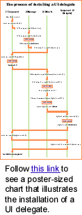
UI installation illustrated
This article comes with a giant poster-size chart that illustrates the process installing a UI delegate. It can provide you with a valuable overview of the delegate-installation process.
To fold out the chart, just follow this link
The UI delegate's installUI() method
is responsible for the following:
- Set default font, color, border, and opacity properties on
the component.
- Install an appropriate layout manager on the component.
- Add any appropriate child subcomponents to the component
- Register any required event listeners on the component.
- Register any look-and-feel-specific keyboard actions (mnemonics,
etc.)for the component.
- Register appropriate model listeners to be notified when to
repaint.
- Initialize any appropriate instance data.
For example, the installUI() method for
an extension of ButtonUI might look like this:
protected MyMouseListener mouseListener;protected MyChangeListener changeListener;public void installUI(JComponent c) {AbstractButton b = (AbstractButton)c;// Install default colors & opacityColor bg = c.getBackground();if (bg == null || bg instanceof UIResource) {c.setBackground(UIManager.getColor("Button.background"));}Color fg = c.getForeground();if (fg == null || fg instanceof UIResource) {c.setForeground(UIManager.getColor("Button.foreground"));}c.setOpaque(false);// Install listenersmouseListener = new MyMouseListener();c.addMouseListener(mouseListener);c.addMouseMotionListener(mouseListener);changeListener = new MyChangeListener();b.addChangeListener(changeListener);}
Conventions for initializing component properties
Swing defines a number of conventions for initializing component properties at install-time, including the following:
- All values used for setting colors, font, and border properties should be obtained from the Defaults table (as described in the subsection on the LookAndFeel subclass).
- Color, font and border properties should be set if -- and only if -- the application has not already set them.
To facilitate convention No
1, the UIManager class provides a number of static
methods to extract property values of a particular type (for instance,
the static methods UIManager.getColor(), UIManager.getFont(),
and so on).
Convention No. 2 is implemented
by always checking for either a null value or an instance
of UIResource before setting the property.
The ComponentUI's uninstall()
method must carefully undo everything that was done in the installUI()
method so that the component is left in a pristine state for the
next UI delegate. The uninstall()method is responsible
for:
- Clearing the border property if it has been set by installUI().
- Remove the layout manager if it had been set by installUI().
- Remove any subcomponents added by installUI().
- Remove any event/model listeners that were added by installUI().
- Remove any look-and-feel-specific keyboard actions that were
installed by installUI().
- Nullify any initialized instance data (to allow GC to clean up).
For example, an uninstall() method to
undo what we did in the above example installation might look like
this:
public void uninstallUI(JComponent c) {AbstractButton b = (AbstractButton)c;// Uninstall listenersc.removeMouseListener(mouseListener);c.removeMouseMotionListener(mouseListener);mouseListener = null;b.removeChangeListener(changeListener);changeListener = null;}
Defining geometry
In the AWT (and thus in Swing) a container's LayoutManager will layout the child components according to its defined algorithm; this is known as "validation" of a containment hierarchy. Typically LayoutManagers will query the child components' preferredSize property (and sometimes minimumSize and/or maximumSize as well, depending on the algorithm) in order to determine precisely how to position and size those children.
Obviously, these geometry properties are something
that a look-and-feel usually needs to define for a given component,
so ComponentUI provides the following methods for this
purpose:
public DimensiongetPreferredSize(JComponent c)public DimensiongetMinimumSize(JComponent c)public DimensiongetMaximumSize(JComponent c)public booleancontains(JComponent c, int x, int y)
JComponent's parallel methods (which
are invoked by the LayoutManager during validation) then simply
delegate to the UI object's geometry methods if the geometry property
was not explicitly set by the program. Below is the implementation
of JComponent.getPreferredSize() which shows this delegation:
public Dimension getPreferredSize() {if (preferredSize != null) {return preferredSize;}Dimension size = null;if (ui != null) {size = ui.getPreferredSize(this);}return (size != null) ? size :super.getPreferredSize();}
Even though the bounding box for all components is
a Rectangle, it's possible
to simulate a non-rectangular component by overriding the implementation
of the contains() method from java.awt.Component.
(This method is used for the hit-testing of mouse events). But,
like the other geometry properties in Swing, the UI delegate defines
its own version of the contains() method, which is
also delegated to by JComponent.contains():
public boolean contains(JComponent c, int x, int y) {return (ui != null) ?ui.contains(this, x, y):super.contains(x, y);}
So a UI delegate could provide non-rectangular "feel"
by defining a particular implementation of contains()
(for example, if we wanted our MyButtonUI class to
implement a button with rounded corners).
Painting
Finally, the UI delegate must paint the component
appropriately, hence ComponentUI has the following
methods:
public void paint(Graphics g, JComponent c)public void update(Graphics g, JComponent c)
And once again, JComponent.paintComponent()
takes care to delegate the painting:
protected void paintComponent(Graphics g) {if (ui != null) {Graphics scratchGraphics =SwingGraphics.createSwingGraphics(g.create());try {ui.update(scratchGraphics, this);}finally {scratchGraphics.dispose();}}}
Similarly to the way in which things are done in AWT,
the UI delegate's update() method clears the background
(if opaque) and then invokes its paint() method, which
is ultimately responsible for rendering the contents of the component.
Stateless vs. stateful delegates
All the methods on ComponentUI take a
JComponent object as a parameter. This convention enables
a stateless implementation of a UI delegate (because the delegate
can always query back to the specified component instance for state
information). Stateless UI delegate implementations allow a single
UI delegate instance to be used for all instances of that component
class, which can significantly reduce the number of objects instantiated.
This approach works well for many of the simpler GUI components. But for more complex components, we found it not to be a "win" because the inefficiency created by constant state recalculations was worse than creating extra objects (especially since the number of complex GUI components created in a given program tends to be small).
The ComponentUI class defines a static
method for returning a delegate instance:
public static ComponentUIcreateUI(JComponent c)
It's the implementation of this method that determines
whether the delegate is stateless or stateful. That's because the
UIManager.getUI() method invoked by the component to
create the UI delegate internally invokes this createUI
method on the delegate class to get the instance.
The Swing look-and-feel implementations use both types
of delegates. For example, Swing's BasicButtonUI class
implements a stateless delegate:
// Shared UI objectprotected static ButtonUI buttonUI;public static ComponentUI createUI(JComponent c)if(buttonUI == null) {buttonUI = new BasicButtonUI();}return buttonUI;}
While Swing's BasicTabbedPaneUI uses
the stateful approach:
public static ComponentUI createUI(JComponent c)return new BasicTabbedPaneUI();}
Pluggable Look-and-Feel summary
The pluggable look-and-feel feature of Swing is both
powerful and complex (which you understand if you've gotten this
far!). It is designed to be programmed by a small subset of developers
who have a particular need to develop a new look-and-feel implementation.
In general, application developers only need to understand the capabilities
of this mechanism in order to decide how they wish to support
look-and-feels (such as whether to lock-down the program to a single
look-and-feel or support look-and-feel configuration by the user).
Swing's UIManager provides the API for applications
to manage the look-and-feel at this level.
If you're one of those developers who needs (or wants) to develop a custom look-and-feel, it's critical to understand these underpinnings before you write a single line of code. We're working on providing better documentation to help with this process -- starting with this document, and continuing with others that will follow soon.
____
AWT: The Advanced Windowing Toolkit. For details, see "Introducing Swing."