 |
|
|
|
|
|
|
|
This page presents the high-level specification
for the Java Look & Feel (formerly code-named "Metal").
This is not an official spec and will be maintained as time
permits. Please send feedback to javahi@sun.com. |
|
|
 |
 |
|
|
|
By Chris Ryan All of the drawings on this page are in the default web-safe theme specified below. The Arial font is used throughout as a placeholder in this spec; we are working on a cross-platform typeface solution. |
|
|
|
windows
internal frame, palette
menus
menu, menu bar, menu item, check box menu item, radio button menu item, pop-up (contextual) menu
controls
button, check box, radio button, scroll bar, toggle button
text components
combo boxes, label, list box, text fields
high level
desktop icons, tool bar, tree view
other
bordered pane, icons, progress bar, slider, tool tip
colours
the default colour theme
|
|
|
|
|
 |
|
|
|
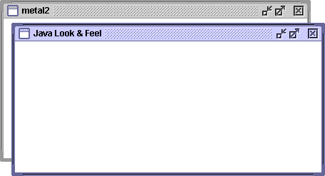
The basic window frame (Internal Frame) defines the Java Look & Feel design and includes all the standard window functions: resizing from any side or corner; dragging from the title bar; and minimize, maximize, and close controls. |
|
|
 |
|
|
|
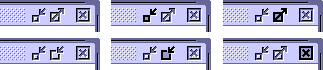
Note the "flat" resize corners. Notice also the texture in the title bar, which indicates "draggability." Inactive windows use the secondary colours, which are typically grey (see colours). Texture and 3D effects are maintained, as the inactive window accepts click-through. Shown below: normal; minimize clicked; maximize clicked; un-maximize button graphic; un-maximize clicked; close clicked. |
|
|
|
 |
|
|
|
|
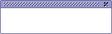
palettes
Palette windows float above other windows in their own layer.
|
|
|
|
 |
|
|
|
|
 |
|
|
|
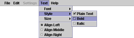
Java Look & Feel menus use the mousedown appearance from buttons, along with primary2 (see colours) as a highlight colour, to show selected menu titles and menu items. Shown here are the menu bar; menu titles; menu items (including one which is selected); check box menu items; and keyboard equivalents. |
|
|
 |
|
|
|
This drawing shows a disabled menu; a hierarchical menu; an item separator; and radio button menu items. Pop-up (contextual) menus look like hierarchical menus (they can have keyboard equivalents). |
|
|
 |
|
|
|
|
 |
|
|
|
basic controls
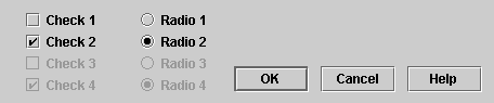
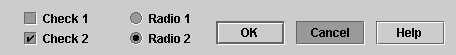
Controls use the "flush 3D" look. Shown here are check boxes and radio buttons in four states (unselected, selected, unselected and unavailable, and selected and unavailable); along with command buttons, the first of which ("OK") is the default. |
|
|
 |
|
|
|
Below are the appearances on mousedown. Button text and/or graphics do not shift on mousedown. A radio button in the "on" state gives mousedown feedback when clicked, as shown in "Radio 2," but remains in the "on" state (the selected button in the set) on mouseup. |
|
|
 |
|
|
|
|
scroll bars
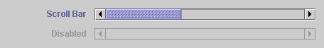
Scroll bars have a textured "thumb" and recessed channel. |
|
|
 |
|
|
|
|
 |
|
|
|
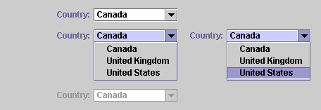
combo boxes
Editable and non-editable combo boxes are visually distinct in the Java Look & Feel. The non-editable variety looks like a button with an arrow to indicate the menu functionality. |
|
|
 |
|
|
|
Editable combo boxes appear as text fields with arrow buttons. |
|
|
 |
|
|
|
Note the label text in the primary1 colour, and the primary3 text highlight colour (see colours). Scrolling menus are a requirement. |
|
|
|
|
list box
The list box uses the primary3 colour to show selection. |
|
|
 |
|
|
|
|
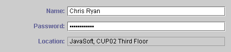
text fields
Shown here are editable, password, and non-editable text fields. |
|
|
 |
|
|
|
|
 |
|
|
|
This section contains compound or complex components. |
|
|
|
|
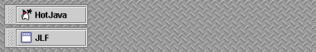
desktop icons
Each minimized window is represented by a horizontally oriented "jlf tag." These tags have a default stacking order--for instance, top to bottom along the left edge of the screen--but can be rearranged by the user by dragging on the textured area (the tags snap to a grid). Shown here are two minimized applications on a "textured jlf" background. |
|
|
 |
|
|
|
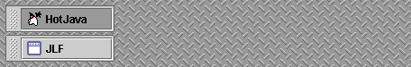
Clicking on a tag restores the corresponding window; here is the mousedown appearance. |
|
|
 |
|
|
|
|
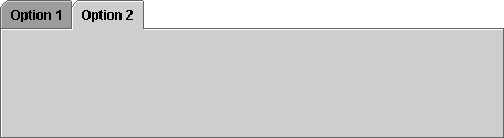
tabbed pane
This control allows the user to "switch panes." It is typically used in option dialogs. (Usages such as the SwingSet demo are not encouraged!) |
|
|
 |
|
|
|
|
tool bar
The tool bar is essentially identical to the menu bar (see menus), except it contains buttons (and, potentially, other controls such as toggle buttons and combo boxes). It is shown here with button borders, but without button graphics. |
|
|
 |
|
|
|
Note the texture at the left edge; this indicates that the tool bar is draggable, or "dockable" in Swing parlance. (This is the only drag area.) |
|
|
|
|
tree view
The Tree View uses "turners" to show open and closed containers. Separators can be drawn between top-level items. |
|
|
 |
|
|
|
Also, hierarchy lines can be displayed (both separators and hierarchy lines are off by default). |
|
|
 |
|
|
|
|
 |
|
|
|
This section includes miscellaneous designs and components. |
|
|
|
|
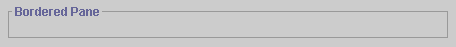
bordered pane
The bordered pane is a single-pixel line (not 3D) in the secondary2 colour, with a title in the primary1 colour (see colours). |
|
|
 |
|
|
|
|
progress bar
The progress bar uses a subtle inset 3D effect, to differentiate it from "flush" user items, along with the primary2 colour (see colours), to indicate "fill." |
|
|
 |
|
|
|
|
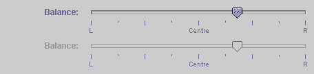
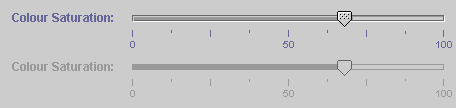
sliders
Sliders uses the "flush 3D" look. Focus is indicated using a coloured slider thumb. |
|
|
 |
|
|
|
A filling slider is provided as an option (shown here without focus). |
|
|
 |
|
|
|
|
tool tip
The tool tip is a small floating "tag" that indicates the functions of controls (typically tool bars) on screen. It uses black text for the label, and the primary1 colour for any keyboard equivalent (in a smaller font), on a primary3 colour (see colours).

|
|
|
|
|
 |
|
|
|
The default colour theme is used throughout this page. The Java Look & Feel colour model uses six colours in addition to black and white. A primary group is used for active items; a secondary group is used for basic drawing and inactive items. The default theme is as follows. |
|
|
 |
black
Used for user text and user items; sparingly in drawing. |
|
|
 |
white
Used for highlights in 3D effects, and user text entry areas. |
|
|
 |
primary1
RGB 102-102-153
HEX #666699
Active window borders, shadows, and system text (i.e. labels). |
|
|
 |
primary2
RGB 153-153-204
HEX #9999CC
Highlight/selection colour; more shadows. |
|
|
 |
primary3
RGB 204-204-255
HEX #CCCCFF
Large coloured areas (e.g. active title bar); text selection. |
|
|
 |
secondary1
RGB 102-102-102
HEX #666666
Inactive window borders; "channel" for flush 3D effect. |
|
|
 |
secondary2
RGB 153-153-153
HEX #999999
Secondary shadows; disabled system text. |
|
|
 |
secondary3
RGB 204-204-204
HEX #CCCCCC
Canvas colour; inactive title bar. |
|
|
|
|
Copyright 1997-98 Sun Microsystems, Inc. All Rights Reserved.Chris Ryan / cryan@eng.sun.com |
|
|