 |
||||||
 |
||||||
|
|
||||||
 |
||||||
|
||||
|
Tweaking the
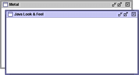
Java L&F We would like to thank you for all of the valuable feedback you sent in response to this article. For the most part, the consensus was that we are on the right track. We did change the scroll thumb back to blue as a result of overwhelming objections to making them grey; and we retained the tree view "turners" for want of a superior alternative. JLF is now frozen for the 1.2 release. Once again, thanks for writing! We would like to thank you for all of the valuable feedback you sent in response to this article. For the most part, the consensus was that we are on the right track. We did change the scroll thumb back to blue as a result of overwhelming objections to making them grey; and we retained the tree view "turners" for want of a superior alternative. JLF is now frozen for the 1.2 release. Once again, thanks for writing! By Chris Ryan It has been almost six months since the debut of the Java Look & Feel (code name "Metal"), and we have received a flood of e-mails in response. We have appreciated all of the thoughtful feedback that has been sent in. There are several components in particular which we have been revising as a result of the feedback; this article discusses a few of the designs we are considering for future releases. Your feedback is welcome at javahi@sun.com. Internal Frame: Title Bar (or: That Darned Notch)
While we have received a number of messages in support of this design, there were several significant issues that needed to be considered. These included (a) an aesthetic problem with the window content not "flowing into" the notch; and (b) the scroll bar, when present, didn't extend to the title bar. Initially we considered simply filling the notch, to preserve the flavour of the original design:
This was implemented for 1.2b4, but seemed a bit of a kludge. The next obvious option was simply to eliminate the notch and using a rectangular title bar:
This is somewhat boring. We needed better graphics for minimize, maximize, and close. And all of the title bars above are taller than those in other operating systems. Our final design adds control graphics that are more visually interesting--and, hopefully, more understandable. These seemed the best balance between target size, legibility, and integration with the overall design..
Shown here are an active and inactive frames. Note how the minimize and maximize controls have been spaced apart from the close control--another request we received. The frame design is now more consistent with the "flush 3D" style used throughout the Java Look & Feel. Scroll Bars
The problem is that the channel and thumb appear on the same virtual plane. For instance, if you can click the right arrow button, maybe it's reasonable to think that you can drag the grey portion to its left. This is a particular problem for users of Motif, because in that environment the scroll bar is lighter than the channel. Our current design uses a recessed channel to differentiate it from the scroll thumb.
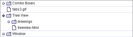
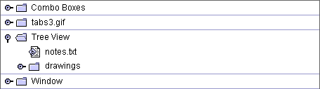
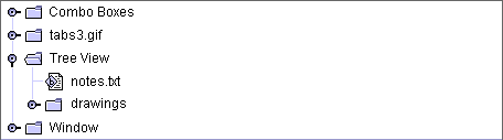
This compromises the "flush 3D" appearance to some extent, but an exception, in this case, seems warranted. The thumb is also toned down a bit to use greys (in the default colour theme), as large blue thumbs tended to draw attention away from application content. Tree View
After trying out literally hundreds of alternatives, our current design uses "turners" to indicate openable objects:
As before, hierarchy lines are an option.
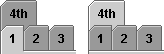
Tabbed Pane
This caused problems if, as above, there are only two tabs: it is difficult to tell which is selected. Our current design uses greys only, and a more traditional design that blends an active first-row tab with the canvas below.
We have, however, retained the behaviour of "non-shuffling" tabs: if there is more than one row, the rows do not change position when a tab in a row other than the first is selected.
We received numerous positive comments about this behaviour, which makes for a much more stable display, despite rear-row selected tabs not appearing to be contiguous with the main canvas. (It could also be argued that multi-rowed tabbed panes are not good design!)
FeedbackPlease send feedback on these designs, and other Java Look & Feel issues, to javahi@sun.com. |