|
||||
Introducing a Custom Layout ManagerBy Byron Hawkins
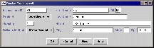
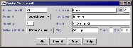
A layout manager arranges its children based on its size and the sizes -- actually the preferred, minimum, and maximum sizes -- of its children. There are two basic approaches to organizing a container with layout managers: the composite approach, and the GridBag approach. This article discusses both these approaches, then demonstrates a custom layout manager -- called FormLayout -- which is a combination of the two (see Figure 1). With the help of screen shots linked to actual code examples, the article shows how the FormLayout manager can simplify the creation and modification of forms. At the end of the article, there's also a link to the FormLayout API. In Swing, the JTree, JTable, JList, and JComboBox components use a single delegate object called a cell renderer to draw their contents. A cell renderer is a component whose paint() method is used to draw each item in a list, each node in a tree, or each cell in a table. A cell renderer component can be viewed as a "rubber stamp": it's moved into each cell location using setBounds(), and is then drawn with the component's paint() method. By using a component to render cells, you can achieve the effect of displaying a large number of components for the cost of creating just one. By default, the Swing components that employ cell renderers simply use a JLabel, which supports the drawing of simple combinations of text and an icon. To use any Swing component as a cell renderer, all you have to do is create a subclass that implements the appropriate cell renderer interface: TableCellRenderer for JTable, ListCellRenderer for JList, and so on.
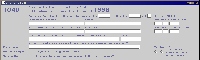
The Composite ApproachFirst we'll talk about the composite approach to layout management. This strategy groups components into panels, and then groups those panels into larger and larger section panels, until the whole layout has been accounted for. In Figure 1, notice that the block of entry fields at the top of the illustration and the row of buttons at the bottom are placed in separate panels. The frame contains these two panels. It uses a Y_AXIS BoxLayout for its LayoutManager. This arrangement is convenient for forms like the one shown in Figure 1, because no matter what is in the block of entry fields and the row of buttons, you're guaranteed that the entry block will be at the top, the button row will be at the bottom, and both blocks will be centered inside the width of the frame. You can see why composite layouts are used primarily for organizing large sections layouts. Unfortunately, if you try to use the composite approach to lay out the entry block itself, you discover its evil twin, the composite nuisance. To see why that's true, suppose that you put the two (general) columns of label/field pairs shown in Figure 1 into separate panels, and that you then lay the panels out using an X_AXIS BoxLayout. That works just fine: the panels will always reside next to each other, and will fill whatever space they are given. But now suppose that you want to add another label and field to the end of the first column, and that you want it to stretch into the second column. The BoxLayout can't help you there, because it can't lay out a component across a column (or row) boundary. Well, let's see . . . You could add another layer, making the two original columns show up together in the top of a new Y_AXIS BoxLayout, and putting the new label and field in the bottom of the new BoxLayout. But then things start to get very complicated. In fact, if you rely only on this approach, you usually have to redesign your whole layout every time you make a minor change. The GridBag StrategyThe GridBag handles the layout of the entry block much more comfortably. Each time you add a component to a GridBag, you also add a constraints object, which has fields specifying the number of rows and columns the component spans, and also specifying various placement, stretching, and filling properties. This approach makes a lot of sense: You could probably look at any GridBag constraints code, look at the form it produces, and see what's going on. But the GridBag strategy really isn't much more efficient for code modification than the composite approach. Why not? Well, suppose you have just designed a Simple Form like the shown in Figure 1 using a pure GridBag layout, and now want to add one more label and field at the end of the first column. To do that, you must to change the row number of each of the buttons. That doesn't sound like such a big deal -- but then, where in your code can you find the row numbers of the buttons? Answer: In the constraints object for each button. Happy trails. What's worse, suppose you have now decided to add another label and field to the right of the Quantity field. Happily, you find that it fits in the space that exists there, without impeding on the second (general) column of labels and fields. Remember, though, that GridBag will put your new components in an additional pair of columns, regardless of what your eye sees, so any components in nearby columns will probably have to be adjusted accordingly. Hope you made a map. Just to keep perspective, the GridBag is the most flexible layout manager available: It will do nearly anything you can think of, as long as it does not compromise cross-platform (cross-monitor) integrity. But you pay for it in code complexity, and it's no bargain. There are a variety of layout managers available at Gamelan.com that attempt to simplify the situation. They fall into three categories: WYSIWYG tools, relative layout managers, and composite approach supplements. WYSIWYG Layout ManagersGamelan's WYSIWYG entries allow components to be placed at exact pixel locations and sizes. This can be dangerous, because you may not know how many pixels are on your user's screen, much less how big those pixels are. Even if you are certain that the WYSIWYG forms will look OK for on all your company's current hardware, you never know what might happen in six months when new hardware is purchased, or your company merges with an organization whose users have only poor resolutions available. If an application really does require WYSIWYG specificity (which is unlikely), then it probably shouldn't be written in the JavaTM programming language. Relative Layout Managers and Composite SupplementsThe relative layout managers you find on the Gamelan site let you give each component a relative location and (usually a pixel-specific) distance from another component in the layout. These are simpler to use than the GridBag, and they will handle many complex layout cases. But, like GridBag, they suffer the ripple effect of new component additions, and are quite limited if you're particular about how your layout looks. Besides, you have to pay for the good ones. The "supplements" to the composite repertoire all duplicate functionality provided in the JDK. The common cry I've heard from developers is that both the composite approach and the GridBag strategy are just too cumbersome. "We're just making record maintenance forms," they explain. "There isn't time for all this!" Consequently, developers typically resort to the WYSIWYG method, and given these options, I would too. So, in the interest of a reasonably convenient alternative that doesn't compromise cross-platform integrity, here is FormLayout.
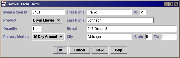
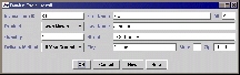
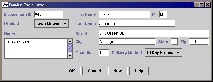
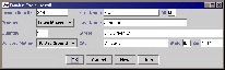
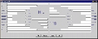
The FormLayout TechniqueThe FormLayout technique, a combination of the composite approach and the GridBag strategy, is what I used to create all the forms shown in Figure 2.
To create a form using FormLayout, you add components and label-field pairs by making a single FormLayout.add() call. In making the call, you specify row and column numbers, along with optional stretch/fill and mode properties. All fields in a column are automatically aligned, allowing room for the longest label. If you want a field or label to be aligned in a special way, you can specify a mode by calling the add() method. Row and column numbers need not be sequential, only ordered, so if you use big numbers, you can easily add components in the middle of the form without affecting the other components. This scheme is especially useful if your are adjusting layout contents at runtime, or generating UI code from a database schema. The stretch-fill property, called fillRightPct, specifies how far a component will stretch to right-justify, relative to the component's size and willingness to stretch (preferredSize - minimumSize, so that components don't stretch out of proportion). If you have a fillRightPct you like, you can set it as the default for the whole layout, and use the parameter only for special cases. You can stuff components into a row without creating extra columns: Just add the component to the existing row and column, and it will find room for itself. In the Simple Form, "State" and "Zip" are stuffed into Row 4, Column 2. Now suppose that you want to add three more label/field pairs at the bottom of the entry block, and that they need to span the full width of the panel. Simply add them in column 0; FormLayout will organize them separately from the components in column 1, and it is not concerned if a component in column 0 reaches farther to the right than a component in column 1. The FormLayout is a work in progress, and still has some limitations in the areas of flexibility and performance -- as you can see for yourself by experimenting with the IRS Form 1040 example. I'd welcome any suggested improvements. Meanwhile, if you're designing a container in which components need to be aligned toward different corners or edges of the regions they occupy, or if you need to specify different cell-padding and filling values for individual components, your best option (in the JDK) may still be the GridBag strategy.
|
||||||||||||||||||||||||