
These days, artificial intelligence (AI) is everywhere we look. It’s what powers predictive searches on Google, enables Spotify and Amazon to recommend new songs and products, puts self-driving vehicles on the road, helps doctors to quickly diagnose diseases…the list goes on. With the presence of AI growing ever larger in our lives, so has the need for us to trust it.
With access to big data and more complex algorithms in machine learning, AI is becoming more accurate in prediction and recognition tasks. Yet, this complexity is often unintelligible and this limits its trustworthiness.
Enter the field of eXplainable Artificial Intelligence. XAI, as it is sometimes called, strives to help people understand the predictions that machine learning models make, to help them trust the technology. XAI employs a range of visualisation techniques —including heatmaps, bar charts, line charts, and decision trees — to explain how input factors influence decision outcomes.
To make explanations less complicated, developers often reduce the number of factors shown. Often, these aid in understanding, but come at the expense of oversimplifying the model, says Brian Lim, an assistant professor at NUS Computing who studies human-computer interaction and machine learning, and leads the NUS Ubicomp Lab.
“On one hand, you get simple explanations like a bar chart, which is nice and easy to understand, but it lacks much detail,” says Lim. “And then on the opposite end of the spectrum, you can get a complex explanation that shows many non-linear line charts with many twists and turns. These are more accurate, but are overly tedious for people to read.”
To that end, an XAI researcher finds himself faced with a challenge: do I choose a simple explanation or an accurate one? This highlights a challenge of choosing between a simple or accurate explanation.
Finding a Balance
To address this challenge, Lim and his NUS Computing colleagues Ashraf Abdul, Christian von der Weth, and Mohan Kankanhalli set about trying to find a way of making AI explanations both simple and accurately faithful. They considered two chart visualisations commonly used in XAI — sparse linear models and generalized additive models.
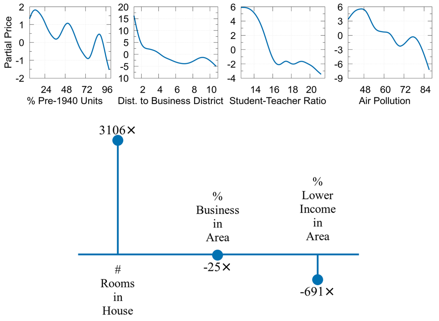
Sparse linear models simplify the model as a linear relationship between each factor and the outcome. This is often represented as a simple bar chart that uses longer bars to indicate the more influential factors impacting a decision. The drawback, however, is poor accuracy.
In contrast, generalised additive models (GAM) represent the model as a sum of non-linear functions of each factor. GAMs are visualised as a grid of line charts. Capable of explaining non-linear explanations, they convey a high degree of accuracy, albeit at the expense of a person expending more mental effort to interpret them.
Drawing from Cognitive Psychology
“To create a user-friendly explanation, it has to be about more than just calculating scores,” he says. “You have to consider how the explanation is presented and what human factors influence a person’s ability to understand an explanation as well.”
The team looked to theories in cognitive psychology — an approach that few researchers take. “We wanted to look at the concept of cognitive load, the mental effort that people need to spend when they’re looking at an explanation,” says Lim. “Many explanations are visualisations, which can be analysed as visual chunks due to our limits in short-term memory. This is akin to us being able to remember numbers with digits as cognitive chunks in a telephone number.
“You can study the number and patterns of lines in a chart, what shapes are used, and so on, to calculate how cognitively demanding an explanation is,” he says. Hence, a sparse linear model has a small number of chunks, counted by the number of bars in its bar chart, and a GAM has a high number of chunks, counted by each twist and turn in a line chart and the total number of line charts.
By using visual chunks as a common framework to describe the cognitive load for bar charts and line charts, Lim and his team were able to define a hybrid solution that blends sparse linear models and GAMs. And hence COGAM, or Cognitive-GAM, was born. “We realised that we could combine the two different visualisation forms to get the best of both worlds, so we can have both low cognitive load and high accuracy,” says Lim.
A Tunable, Blended Explanation Visualisation
To make explanations both simple and accurate, the team would make adjustments in two ways. First, for each line chart, its curve is made iteratively straighter or “less wriggly”. This can be done until the curve is a straight line or zeroed. Second, the explanation is revised to become a hybrid visualisation that combines the multiple line charts of GAMs and single bar charts of a linear model. Straight charts are displayed as a bar in the bar chart and zeroed charts are removed.
“By reducing the number of visual chunks, we can reduce the cognitive load,” explains Lim. “And because we quantified this cognitive load, we can choose how many and which chunks to smooth away to conserve the drop in accuracy. This makes sure we don’t simplify explanations too much or too little.”
As with any good HCI work, the researchers validated the accuracy and simplicity of COGAM in a simulation study and two user studies involving 400 participants from Amazon Mechanical Turk. The simulation study on four benchmark datasets helped to select the COGAM that best balances simplicity and accuracy. Next, they calibrated the estimated visual chunks against the user’s reading time of explanations.
They then conducted a controlled user study comparing COGAM against sparse linear models and GAMs as baselines.
“It was particularly important to capture how much cognitive load the user experienced, how well they could remember the explanations — and not just how easily they could read them,” says Lim, who carefully designed objective tasks and survey questions to assess cognitive load and comprehension. “In addition, we measured how well the users could apply their understanding to new cases, which reflects a deeper level of understanding,” he said.
Through statistical analysis, the results of their testing, to be published at the Conference on Human Factors in Computing Systems (CHI) in April, were more than encouraging. COGAM proved successful in reducing cognitive load without sacrificing accuracy, with users finding COGAM explanations quicker to read and easier to remember compared with GAM explanations.
Collaborating to Advance Human-Centred Explainable AI
COGAM benefits not just users, but XAI developers too, says Lim. “It provides more flexibility for developers to tune their explanation complexity based on the application requirements.” For example, music listeners may prefer simpler but less accurate explanations for automatic song recommendations, while medical doctors may require more detailed and accurate explanations with higher cognitive loads for an AI-assisted medical decision-making task.
Today, Lim’s lab and his collaborators continue their work, this time exploring explanations for different domains, for example natural language processing and medical AI. They are also studying other human factors involved in understanding these visualisations.
“We need to pay attention to human factors when developing explainable AI,” says Lim. “I hope there will be more collaboration between researchers in Human-Computer Interaction who design user-centered visualisations, those in psychology who study human factors and usability, as well as those in Artificial Intelligence who mathematically develop explanation algorithms.”
“Together, we can develop explanations that people are comfortable and confident to use,” he says.